
a Visit Las Vegas site
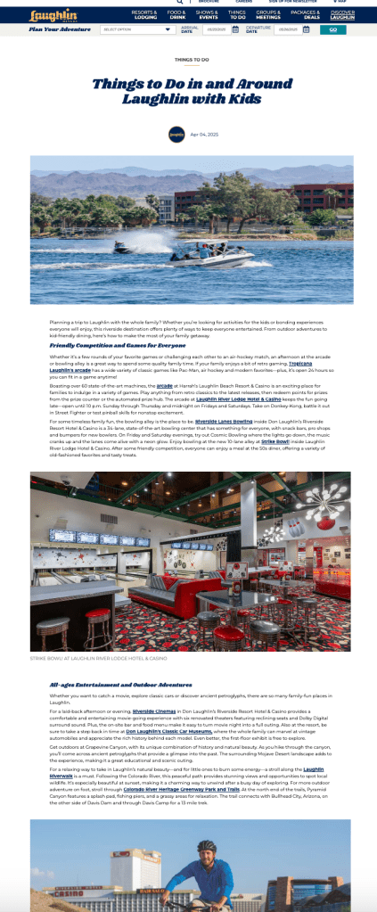
I redesigned this Blog page based on client specifications to overhaul their previous Blog page on the Visit Laughlin site. This project was accomplished using CSS with some JavaScript, matching the provided Figma comps at both desktop and mobile sizes while ensuring a responsive, mobile-first design. This work also required manually adjusting assets, such as the site logo, to match the sizing of the comps and also altering settings in the client’s CMS, such as which widgets were used on certain pages. Among the CSS changes involved were such things as image sizes and placement; font, text size, color, and line-height; spacing and positioning of elements (padding, margin, etc)–all with a mobile-first approach while matching the screen sizes of the provided comps.
This was a fun project to work on because the before and after of the Laughlin blog page was such a stark contrast. The list of changes to create the finished product seemed daunting, but I was able to progress through them quickly. A few questions arose during the development process, but communication through the product manager to the client allowed the work to continue without unnecessary blocks and ensured a smooth procedure from start to finish.
 Kate Sivy